 Uncover overrepresented cancer hallmarks
How does CancerHallmarks.com work?
In this brief video, we guide you through the key features of the platform, demonstrate how to input your gene list, explain how to interpret hallmark enrichment results, and show you how to download publication-ready plots.
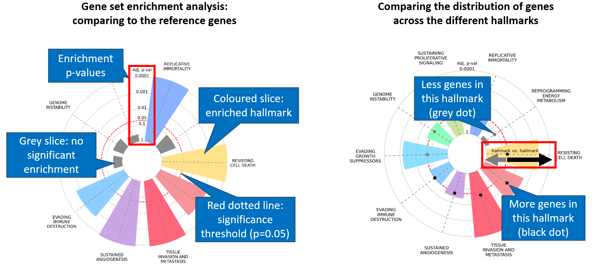
What does the hallmark enrichment plot show?
The first layer represents the enrichment of cancer hallmarks compared to a reference gene set. Differently colored slices represent each of the ten cancer hallmarks — only significant ones (adjusted p < 0.05) are colored. Slice size corresponds to enrichment strength.
A second layer compares gene distribution across hallmarks. The Hallmark vs Hallmark value equals observed genes divided by expected genes per hallmark. Black dots indicate relative hallmark representation; grey dots indicate hallmarks with no genes.
Integrated vs. Core gene set
We merged gene sets from seven resources into the "Integrated cancer hallmark gene set" (6,763 genes). Genes appearing in at least two resources form the "Core cancer hallmark gene set" (1,574 genes).
Advantages over Gene Ontology
- Direct link to biological cancer function
- Cancer-specific gene curation
- Facilitates data integration and cross-study comparison
- Publication-ready graphical output